Currently studying Graphic Design at college to progress on to university to do a BA honours degree in Graphic design with the intentions to become a Graphic Designer for Adam and Eve.
Showing posts with label artwork. Show all posts
Thursday, 14 March 2013
Tuesday, 22 January 2013
TYPOGRAPHY
Here's just a small sample of the typography i have been working on over the course at Wigan And Leigh, with my typography work i base it on the work of BO130 as his work is amazing and really eye-catching. I know my work will never live up to the standards of some of the most famous artosts in history but for people to notice the inspirations used in my work is amazing.
i try to keep my work very sharp and clean as you can see in these few images but im getting used to loosening up and letting go with my work and im starting to like it.
these images are taken from my first year work as i was starting to understand Graphics But i am improving and getting a lot better as i study more and practice.
TRIAL AND ERROR IS KEY!!
MAKING A START ON MY PORTFOLIO
Started to make my Portfolio for university today and hit a giant mental block of what to put in and what works well as a page. i am really struggling as this one thing is the decider for the rest of my life and i cant help but worry.
All week i have been taking photos of my work and cleaning them up ready but now its time to start it im not happy with my work.
So heres a start. Tell me what you think, too plain? too boring?
HELP!!!!
SEASONS- GRAPHICS
In the 'Natural Framework' brief for Graphics we had to produce four postcards, one to symbolise each season and here are my final postcards. all these are hand rendered done under the influence of artists Stefan Sagimeister and Nadia Flower.
I am happy with my outcomes as they symbolise each season really well. My favourite is the 'Summer' compostion as so much detail went into the 'R' and a variety of media used to make the composition come to life.
Labels:
artwork,
design,
fineart,
fineliner,
flowers,
gouache,
graphics,
pastel,
photoshop,
typography,
watercolour
Wednesday, 16 January 2013
NATURAL FRAMEWORK
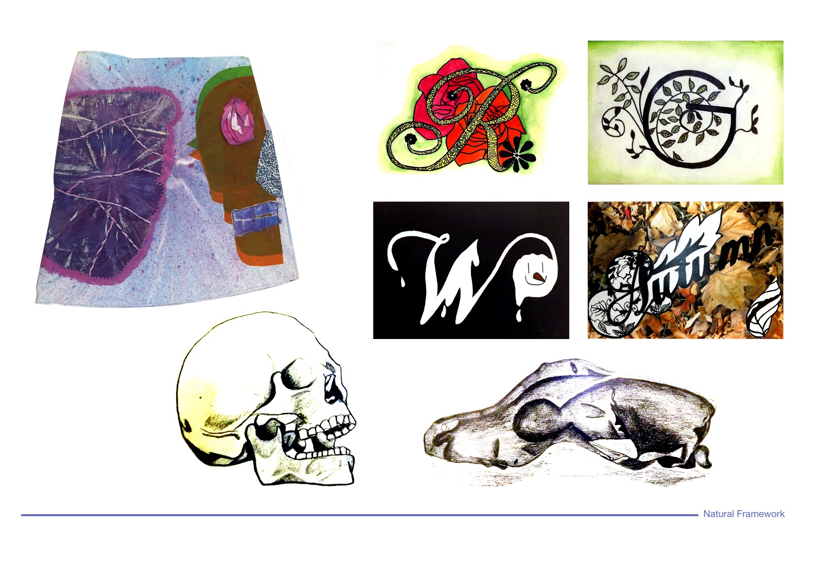
This project was based on natural framework with the outcome of a skirt for textiles, a piece of body armor for 3D, a number of lino and etching prints for fine art and finally four postcards one for each season for graphics. we looked at artists such as Stefan Sagmeister and Nadia Flower. i enjoyed this project as it was challenging and linked to life drawing.
Here are some off my outcomes;
Labels:
artwork,
butterflies,
design,
england,
fineart,
fineliner,
flowers,
gouache,
graphics,
pastel,
photography,
typography
DOODLING AT NIGHT
So last night me and a friend were talking about making t-shirts with alternative characters on them; Cinderella with tattoos and piercings. This got me thinking about the idea and i started to doodle up an image, i looked at the work of 'Tim Sharmate Illustrations.' It helped me to think of new ideas.
Done in Fineliners.
This is just the start;
Tuesday, 15 January 2013
FMP PROJECT, BRITISH CULTURE -GRAPHICS
For my final major project with culture i chose to do the British culture of the 1980' with the Punk scene being the main influencer. The mediums i used for this project were not ones i am used to using such as screen printing, spray painting and collage.i enjoyed using new techniques but took a while to understand the stencilling process of detailed images. This project had so many outcomes but for Graphics we had to make a poster to go into the TATE Gallery. My final piece consisted of scans of all my prints, placed in a thumbnail layout with the body text at the bottom. The artists i studied for this project were; Craig Michael Martin, Jamie Reid and Patrice Poch. these artist influenced everything i did within this project as their work and mine are very alike.
Here are just some of my outcomes;
Tuesday, 11 December 2012
FMP CITY PROJECT
For my final major project with culture i chose to do the British culture of the 1980' with the Punk scene being the main influencer. The mediums i used for this project were not ones i am used to using such as screen printing, spray painting and collage.i enjoyed using new techniques but took a while to understand the stenciling process of detailed images. This project had so many outcomes but for Graphics we had to make a poster to go into the TATE Gallery. My final piece consisted of scans of all my prints, placed in a thumbnail layout with the body text at the bottom. 

Labels:
artwork,
design,
docs,
graffiti,
graphics,
jamie reid,
punk,
typography
YEAR TWO SPECIALISM-FINE ART
Tuesday, 4 December 2012
GRAPHICS-COLOUR SYMBOLISM
My brief was to study 'Colour Theory' with the outcome of 5 colour compositions to relate to colour symbolism. The artists i studied throughout this project were David Carson, Stefan Sagmeister. The compositions had to be 125x120cm. To get the background research i looked at colour theory as a whole with tints/hint, analogous/complementary/tertiary colours and more. Throughout the process or the project i have many outcomes and ideas for these compositions but these are the final ones 

Labels:
artwork,
design,
fineliner,
fruit,
gouache,
graphics,
photography,
photoshop,
typography,
watercolour
Subscribe to:
Posts (Atom)